
Semester Project
Oppløsning
Student project
Scroll ↓
Client
Litfest – International literature festival located in Bergen, Norway. Litfest is known for its diverse literature, languages, cultures, and geographical representation. The festival aims to be bold and innovative while accessible to a broad audience.
Problem
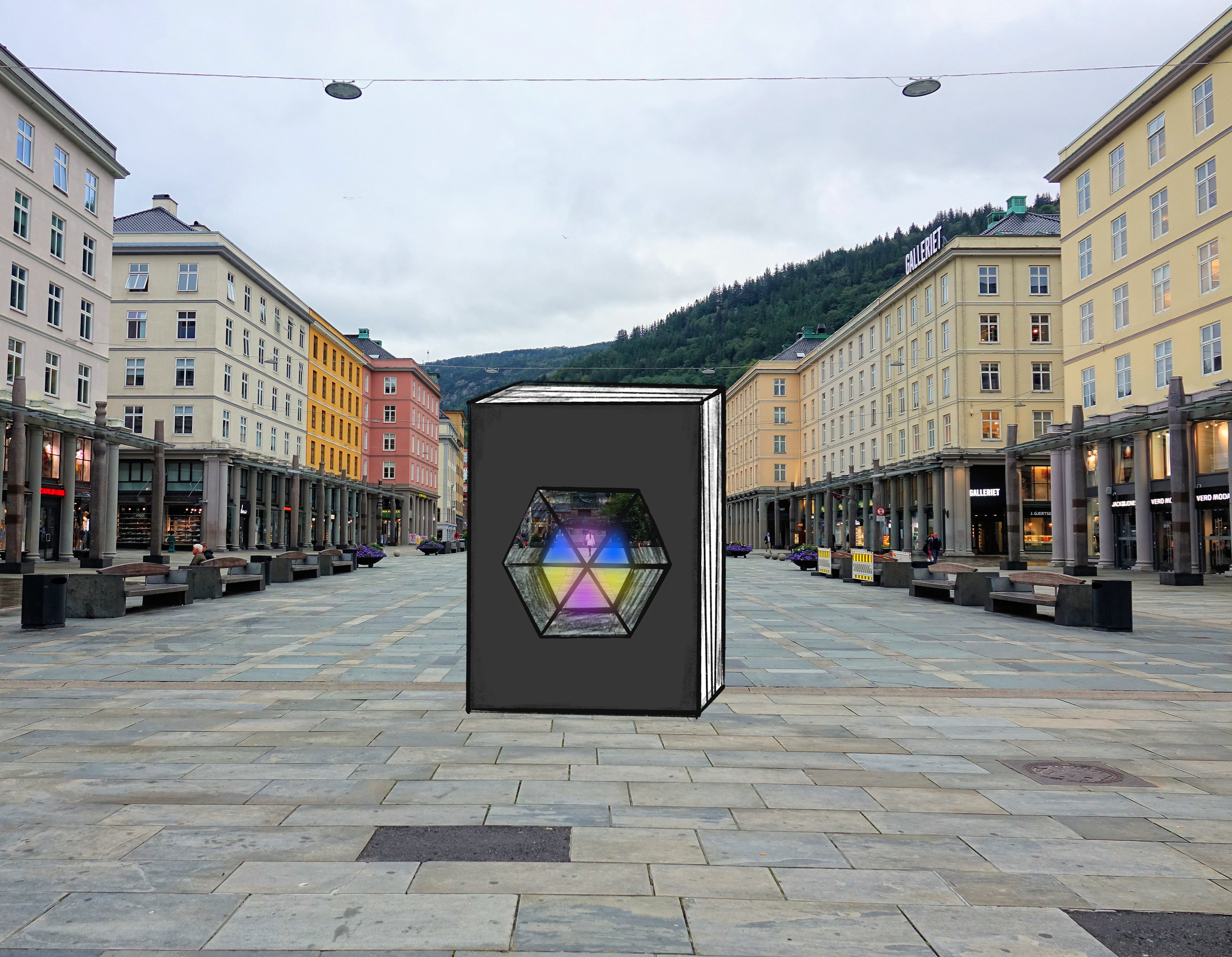
The client had an existing logo but needed a thematic design for the 2024 theme “oppløsning” (resolution). Each year, the festival introduces a new theme and colour that must be expressed visually. The challenge was to translate the abstract idea of oppløsning into a strong visual identity that could be adapted across posters, program covers, digital ads, event screens, and also establish the festival’s presence throughout the cityscape in a creative and engaging way.
Solution
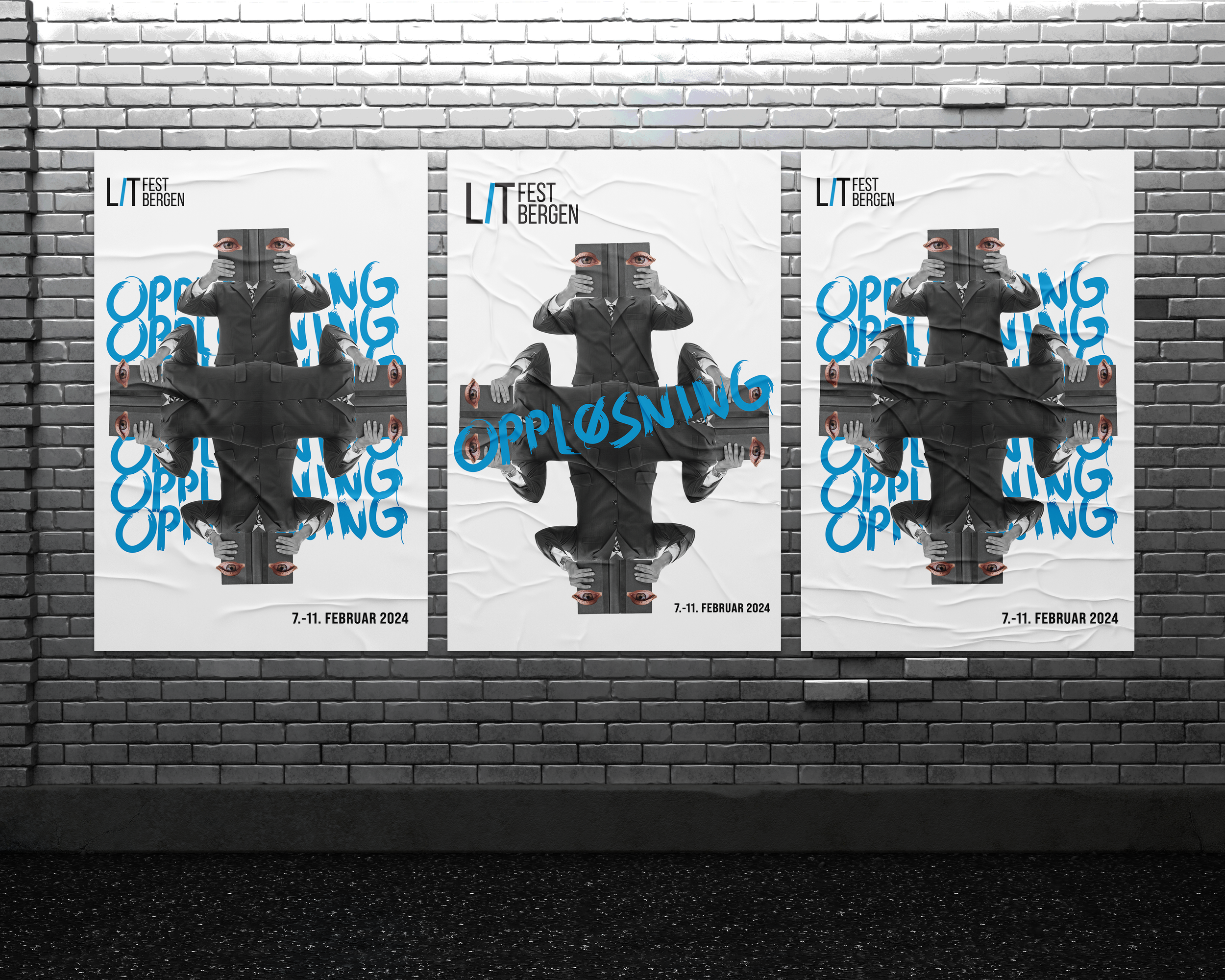
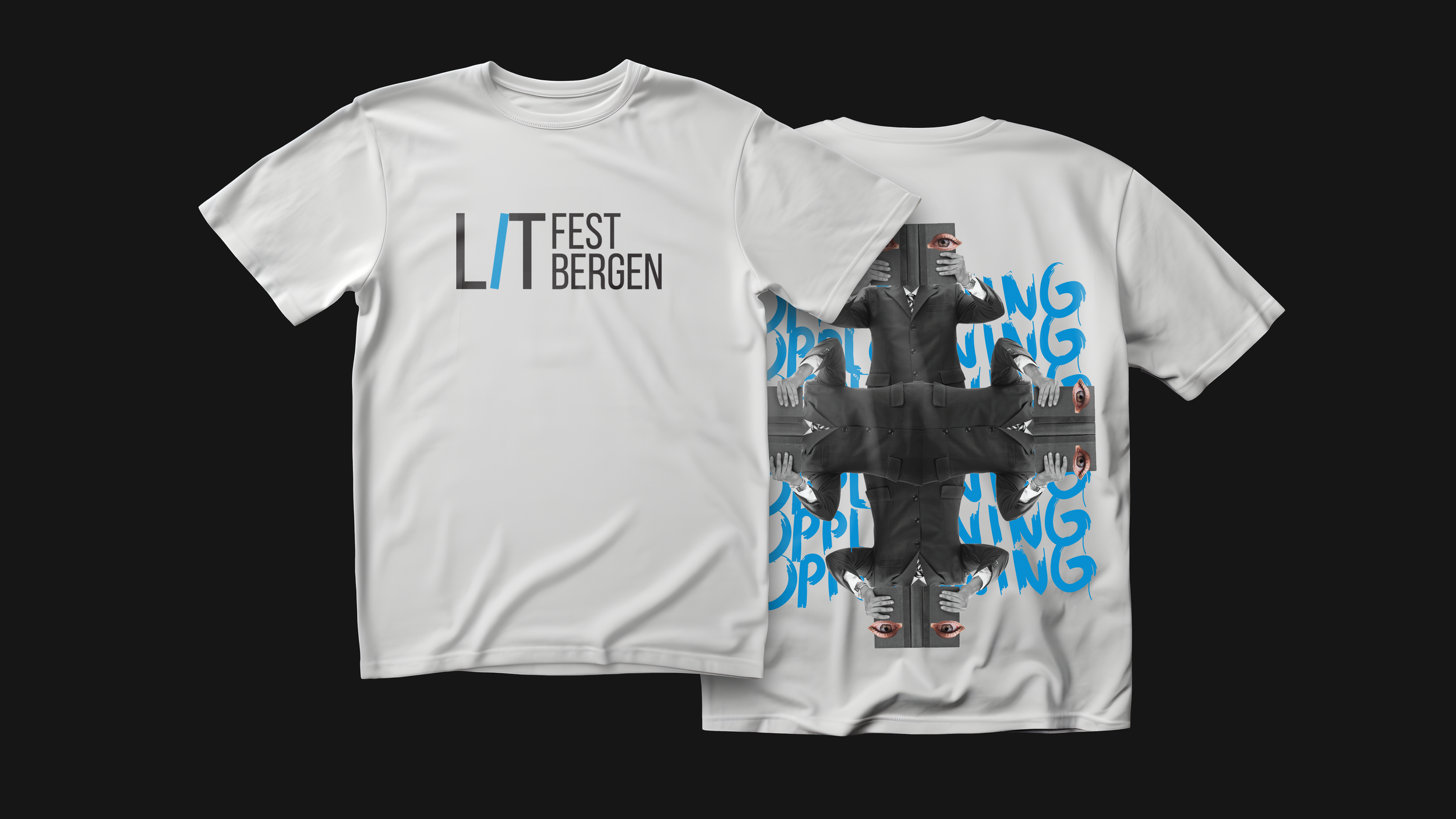
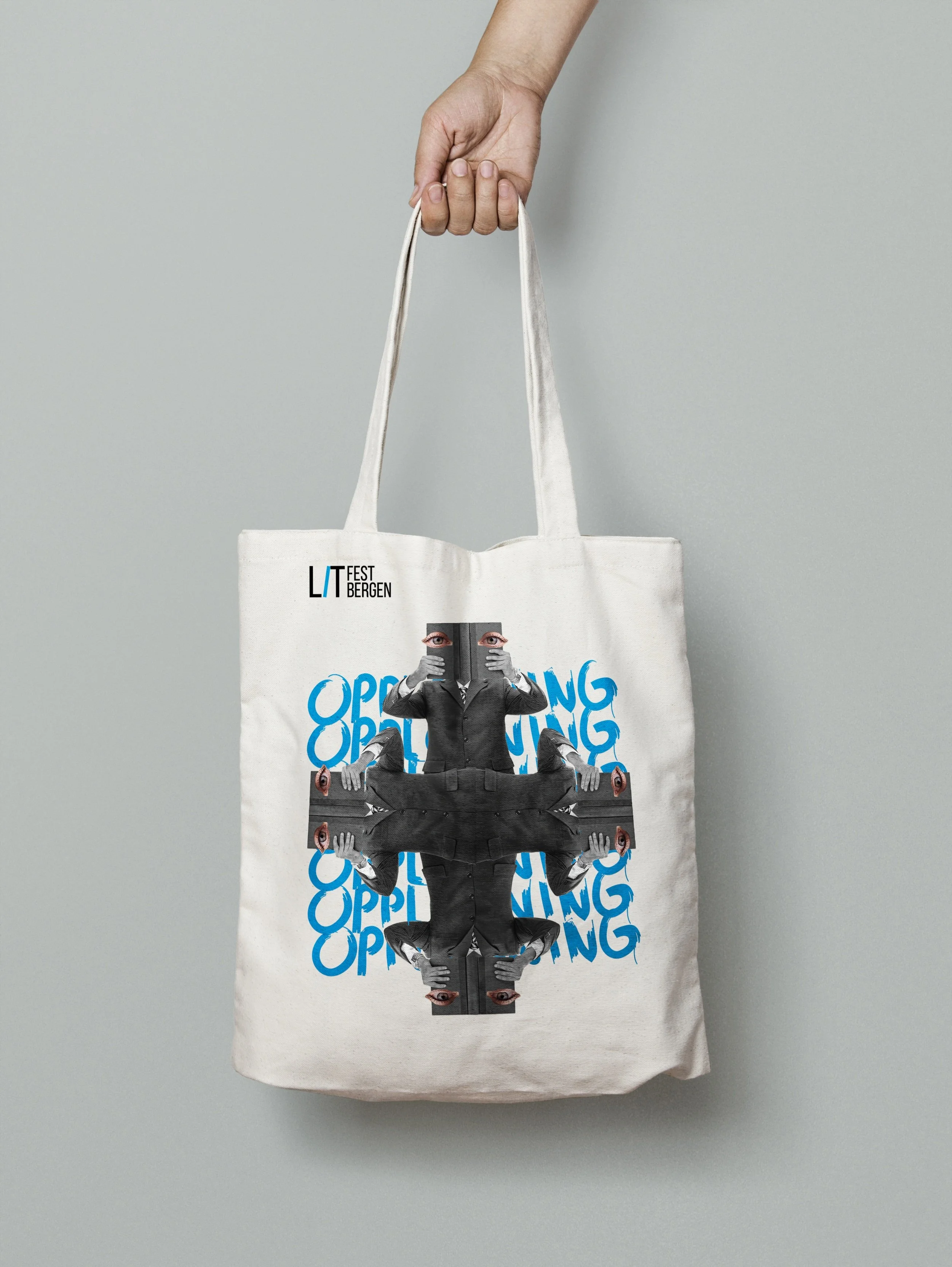
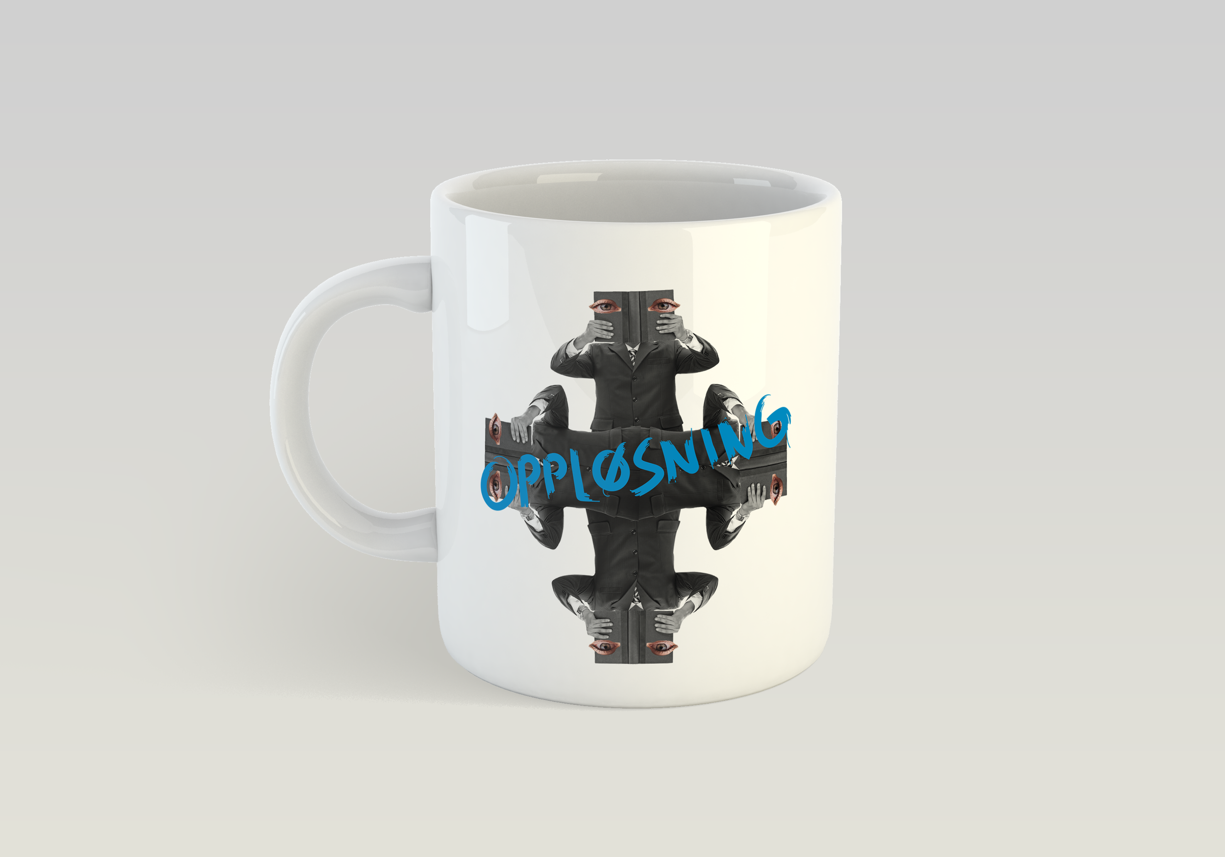
I chose a kaleidoscope-inspired composition to symbolise how literature breaks down and reframes meaning, offering us new perspectives and angles. The design combines a businessman figure, representing the grey routine of everyday life, with cut-out eyes peering through books, a metaphor for pausing, reflecting, and gaining new insight through literature.
The bold use of the annual theme colour ties the visuals together, while the layered, mirrored effect creates a striking presence adaptable across digital and physical media, aligning with the festival’s vision to be bold, innovative, and accessible to a broad audience.
Year: 2023
Responsibility: Creative Direction, Concept Development, Campaign Design, Visual Identity
“Se verden fra en annen oppløsning “
Constraints
The design needed to align with the existing festival identity while introducing a new thematic element
The visual identity had to be adaptable to multiple formats, including digital and print
The design should be engaging for the target audience and attention-grabbing for passersby
Key Learning
One of the key learnings from this project was the importance of thoroughly understanding the festival’s existing identity and target audience. By exploring different design concepts through brainstorming and mind mapping, i was able to align the visual identity with the festival’s core values of diversity, creativity, and accessibility. The creative process also emphasized the value of integrating the festival’s theme into the visual identity in a way that resonates with the audience and enhances the festival’s impact. The choice of colors, typography, and design elements, particularly the kaleidoscope-inspired visuals, played a crucial role in conveying the theme of “oppløsning” in a visually compelling manner.
The Conclusion
In conclusion, the successful development and implementation of “oppløsning” visual identity demonstrate the power of strategic design in enhancing a festival’s presence and impact. By focusing on the festival’s theme and also exploring creative ways to mark its presence in the cityscape. The use of a kaleidoscope as a central design element effectively captured the festival’s spirit of exploring different perspectives through literature, making the visual identity both meaningful and memorable.
The Result
The visual solution for the festival’s theme, “dissolution,” was creatively integrated into the festival’s branding, ensuring a strong presence in the cityscape. The use of a kaleidoscopic design, inspired by the concept of seeing the world through different perspectives, was a key element in capturing the festival’s essence and engaging a broad audience.